Clinical trials are how we find out if our treatments work. They are fundamental to the debates over psychiatry. They are the evidence for the profession’s effectiveness, and instruments for its improvement. Understanding them, what their results mean, and how much they are to be trusted is therefore a fundamental skill, not just for professionals, but for service users trying to “open the hood” and see how and why the treatments they were recommended gained credence. They also reveal why diagnosis is so essential to making progress with treatment.
This blog is therefore my attempt to demystify clinical trials sufficiently to allow people to begin to make sense of them, particularly now they are becoming increasingly available openly. As with all my blogs, I’m going to try to keep my language as non-technical as possible, while not simplifying the issues involved.
To do that, we first need to tackle maths phobia.

He doesn’t know it, but he’s looking at a recipe

Yes, just like this one
The iid Assumption
We cannot avoid assumptions: trying to make none eventually leads to solipsism.

Descartes’ assumption of his own existence: even that’s been challenged these days, as this programmed brain shows

It’s essential to be aware of the limitations of any assumption you make

Here we can see two different populations; apples and oranges. So, the first i is an assumption that whatever we’re looking at can’t be divided like this.

Everything in the picture above is a tomato. So, they meet the first i criterion of our assumption. The obvious difference we see results from them breaking the id part. The the big and little tomatoes come from groups with different average sizes (and, if we look carefully, colours). So, their two populations do not have identical distributions for size and colour.
It’s also important to notice that iid is a decision we make, not a property of things in themselves. Take our first picture, of apples and oranges. If we were talking about fruit, then the picture would be iid, because we’ve blended the apples and oranges together.

Apple and orange distribution
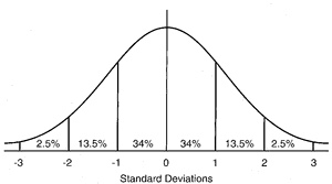
The standard normal distribution. Read on to find out what it is
- A population: that’s just a group of things. Quite literally, anything will do.
- A dimension: some quality every population member has, but to a different extent. We are going to assume that the dimension can be measured using an interval or ratio scale, as described in my previous blog. If you don’t want to read the blog, it’s a scale that works like an ordinary ruler.
- A measure: something that can tell us when the population members differ on the dimension.
We use our measure on our population, and it gives us a range of different results, as we expect. The set of results (or values) we get is called a variable. Using our values, we can now arrange our population along our dimension.

All nicely arranged. Yay! We made it!
Provided the iid assumption holds, and for a given measure, measuring different members of a population is the same as measuring the same population member repeatedly
So, measuring an iid population with a good enough measure will result in a normal distribution of values, assuming the measure is at least an interval scale. The second reason relates to sampling, which I talk about next.
Sampling and the normal distribution
God has the time, resources and immunity from boredom to fully measure iid populations.

Fancy measuring every hair in Longfellow’s beatd?
The parameters of the normal distribution
We already know how to calculate where the middle of our distribution is; it’s the average value (mean), obtained by adding all the individual values up and dividing by the total number of values we used.
By convention, it’s usually symbolised as μ (greek for m). We write its calculation as
μ = Σ(x)/n where Σ means “add up all the x’s values”. Yes, it’s a recipe.
By analogy, our estimate of the width of spread is also a kind of average, though we call it the standard deviation. It’s calculated by subtracting the mean from each value, squaring them (which stops them adding up to zero), adding them together, dividing by the total number of differences we used, and then taking the square root to get us back to our original scale.
It’s symbolised by σ (greek for s) and we write its calculation
σ = √Σ(x-μ)²/n
Before moving on, it’s important to see what these parameters let us do. First, if we subtract the mean from every value, and then divide each value by the standard deviation we will end up with exactly our drawing of the normal distribution above: mean zero, standard deviation of one. Because this recipe converts any normal distribution to this one, it is called the standard normal distribution, and it’s very useful. Here it is again, in more detail
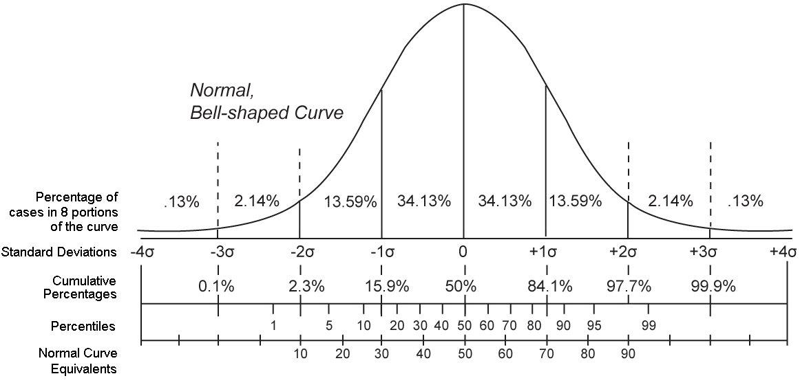
The standard normal distribution five ways
Our recipe for the standard deviation has another trick up its sleeve. If we leave out the square root stage, we end up, unsurprisingly, with σ², which turns out to be far more interesting. We call it the distribution’s variance. If we think back far enough in our education, we remember that squaring was called that because it defined a square. For that reason, the variance measures the area under the curve of our normal distribution. Now, remember that curve is the result of how our population are stacked along our dimension. That means the area below it has all the possible information our distribution can give us, which the variance has neatly summarised into a single value. Furthermore, our drawings show us that that we can slice the variance into chunks, which allows us to make attributions to different amounts of it. This allows us to judge how how much of the variance might be accounted for by an attribute. We have something that can potentially tease out cause.
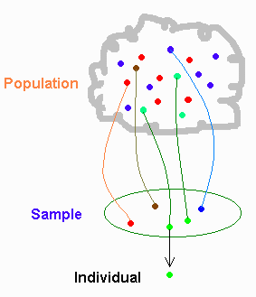
Sampling
There are two problems to solve when sampling
- How to get a representative sample
- How to use the sample to measure the population it represents

The sampling process

When we make the wrong iid decision in a clinical trial
- Diagnosis groups associated symptoms and signs together
- These associations predict a common cause, even if that cause is unknown
- There is a whole science (epidemiology) devoted to understanding populations of diagnoses.
- In a clinical trial, the symptoms that make up the diagnosis are the target of our intervention.
Using diagnosis gives us a credible iid population to sample (in the diagram above, it’s our sampling frame). Because the diagnosed population is iid with respect to diagnosis, we can simply collect as many diagnosed cases as we need, and be confident our sample can represent the diagnosed population (in real life, things aren’t quite like this, but we’ll come to that later) We can now define the basic question our measurement needs to answer.
Does receiving a treatment stop a population being iid with those who did not?
Notice that our question implies no direction. If the direction is one we want, we talk of “effects”, if not, it’s “adverse effects”.
Also, because what we’ve got is a sample, that means we have a measurement gap to bridge.
From our earlier discussion, it follows that, when we measure an iid population appropriately, the distribution measures error, so our interest focuses on the mean. But now, each time we measure an iid sample, that error will give us a slightly different estimate of the mean. These estimates form their own distribution, with its own average degree of variation, called the “standard error of the mean”, which can be calculated.
The standard error of the mean (SE)
- σ = population standard deviation
- N = total sample size
SE = σ/√N
We’ve solved our mean estimation problem, but only if we can solve our standard deviation one. This turns out to be almost trivially easy. For a sample of any size, with a mean of m, the “sample standard deviation” s is s=√Σ(x-m)²/N-1. Despite the confusing name, s is the estimate of σ from the sample. As, under iid, m is an unbiased estimator of μ, we can substitute m for μ, and so calculate SE. We’re all set.
Randomisation
In an ideal world, we wouldn’t need randomisation. We could simply give our intended treatment to some of our iid sample, measure, and see if that group remain iid with the others. However we’ve only ensured our sample is iid with respect to our sampling criterion. Reality is more like the diagram below.
The dots show they’ve all got the same diagnosis. But, they’re different colours.
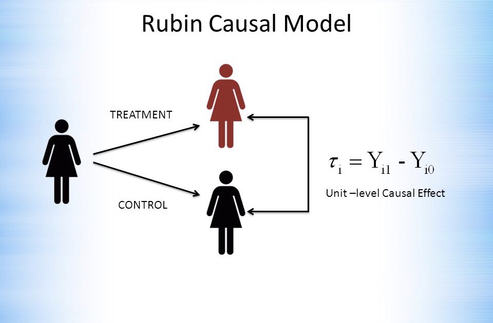
Ideally, we’d like the case and control to be the same subject

Schrodinger’s cat: Rubin’s causal model in action at the unit level
- As the randomisation process was done without respect to any dimension, the groups are iid with respect even to things we haven’t measured or recorded. Randomisation is unique in being able to guarantee this.
- The larger the groups, the better the approximation to iid they will be.
Clinical trials following these principles are called Randomised Controlled Trials (RCTs) and are generally considered the gold standard for assessing treatments, due to their unique ability to cope with unmeasured variables.
This chart shows how much difference controlling for unmeasured variables can make
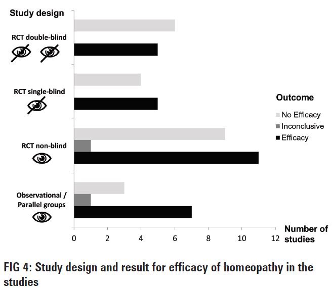
It’s actually not from a single RCT, but from what is called a meta-analysis, which groups studies together. There’s more on them below. The lowest set of bars shows that many more studies without randomisation support the benefits of homeopathy than do not, but that the balance corrects sharply when randomisation is introduced.
The chart also mentions another important feature of good clinical trial design: single or double blinding. This is part of accurate measurement, which we now need to discuss, as measurement is harder than it looks
Measurement
Those reading carefully will have noticed that the last chart talked about “efficacy” rather than “effectiveness”. This is because, even with randomisation, any new difference between our previously iid groups isn’t just the causal effect of the treatment. Unfortunately, what we measure has four components.
- Efficacy. This is what we are after: the part of the measured difference that is due to the treatment.
- Random variation. As we saw above, this is an unavoidable part of measurement, and its effect can be estimated. Even so, there are some measures that are especially sensitive to its effects. For example, hospital admissions occur when things are especially bad, and discharges when they are better. Random variation will therefore tend to exaggerate differences based on these two measurement points.
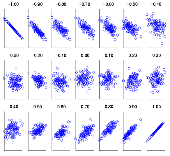
- Regression to the mean. This is actually a consequence of random variation. Think back to our standard normal distribution. Measurement of an iid sample will lead to our values clustering round the mean. So, if we measure a subject from that sample, and find an extreme value, measuring s/him again will most likely return a value closer to the mean. The size of this effect can be calculated from knowing how strongly the two measurements are associated. This association is described by their correlation coefficient rand the proportion of an effect caused by regression to the mean is 1-r. Clearly, the more reliable a measure, the higher (and positive) r will be, and the less regression to the mean will be a problem.
Showing how the correlation coefficient relates to the strength of association between two variables
- Placebo effect. This is the effect expectation or desire can have on our measurement. While “placebo” implies that its effect will be benign, this is not always so, as bad expectations bias us in their direction also. When that happens, it’s called a “nocebo effect.”
The placebo effect is not an artefact, as the diagram below shows, but a genuine psychological phenomenon, probably involving the dorsolateral prefrontal cortex.
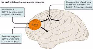
transcranial magnetic stimulation temporarily, and Alzheimer disease permanently, cause hypofunction in the dorsolateral prefrontal cortex. Both reduce the placebo effect
I have blogged about the importance of validity, and how it relates to reliability, elsewhere, so here I will simply observe that a valid measure is an unbiased measure, which we have already seen is an essential prerequisite for effective measurement
Analysis: simple or complicated

Simple
Complicated
- Answering an additional question such as “how much of the variance (see earlier) in the change we’ve measured is due to our treatment (or some other causal factor).”
- Correcting for some flaw in the research design.
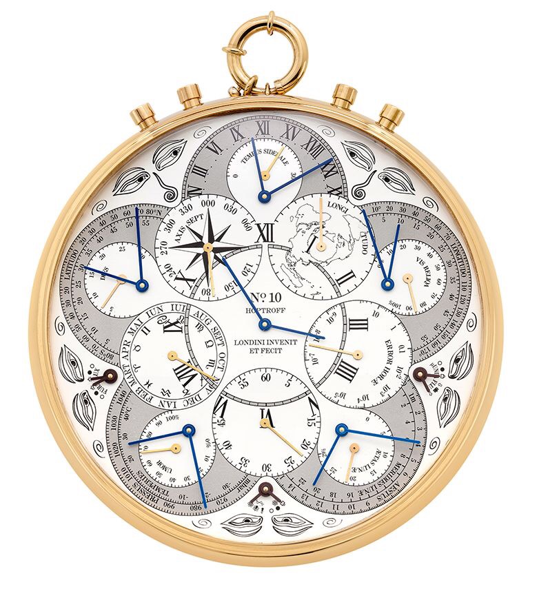
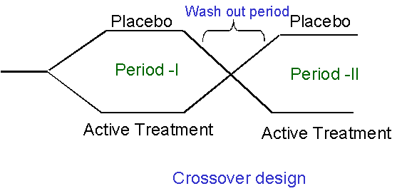
The trouble with complications, in both clinical trials and watches, is that they bring additional assumptions (not least, that they will make things better rather than worse) and possibilities of error. Do we really understand what all those additional dials mean, and how they relate? Nowadays, very complex statistical analyses can be run very easily on a computer. Unfortunately, understanding their subtleties has got no easier. This can be seen with a type of clinical trial called a cross-over study.
Doesn’t look too complicated, does it?
The advantage of a cross-over design is that each subject can act as their own control, thus bringing us closer to Rubin’s ideal. The disadvantage is that even major journals can fail to identify errors in the analysis strategies used. So, the more complex the analysis, the more carefully and clearly it should be explained. If the explanation doesn’t seem to make sense, it might be because it doesn’t! Even charts can be misleading, if they’re not read carefully. Here’s some charts from a study (not an RCT) comparing two forms of psychological therapy in depression.
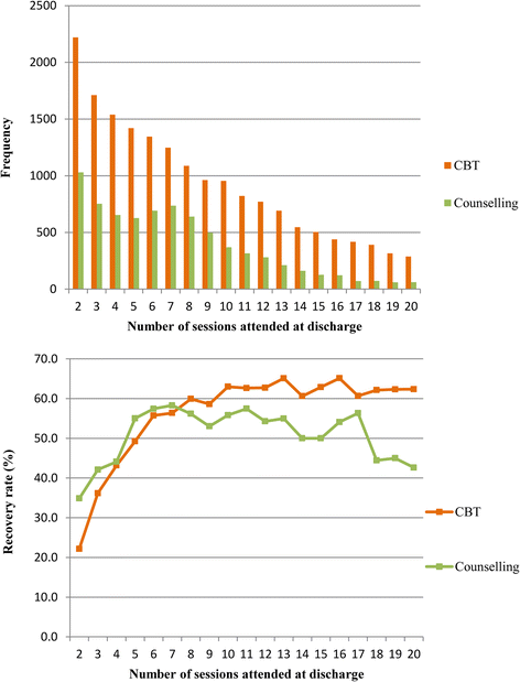
While not mentioned in the paper, counselling has been traditionally understood to be more appropriate for people who are struggling, but whose difficulties relate to specific life problems, that might be expected to resolve. Even experienced psychologists have been known to misinterpret the lower chart as showing patients with counselling getting worse relative to CBT. However, the upper chart shows that counselling, as predictable from its customary use, seems to have a preferred number of sessions, (around seven), while the continuous lines used in the lower chart are misleading. Checking the Y axis makes clear that there are different groups of subjects represented at each time point, so the lines joining them should not be interpreted to suggest continuity. What the chart shows is that a smaller proportion of people in counselling recover than people in CBT, when the number of sesssions attended rises beyond seven.
Post-Hocery and how to avoid it
Read some statistics textbooks, and it would be easy to think that the way to proceed is to look at the data to get an impression of what it might be telling us (that’s called exploratory analysis) and then decide what we’re going to do. For clinical trials, that isn’t a good idea. The reason is easier to understand if I use an analogy.

Think of our treatment as an arrow, and the centre of the target as a cure. A clinical trial should tell us where on the target the arrow has landed.
Putting everything together that we’ve covered so far, we are now in a position to set out a set of seven simple yes/no questions we should ask when ourselves when reading a clinical trial.
- Has the sampling frame provided a sample that is convincingly iid?
- Have the groups been properly randomised with respect to each other?
- Are the randomised groups large enough to be convincingly iid with respect to each other?
- Has blinding been used?
- Do we know how valid and reliable the measures are?
- Is there a simple analysis that shows whether the groups are different or not?
- Was the analysis pre-planned?
When using this list of questions, a “don’t know” should be treated the same as a “no”. In general, the fewer questions we can answer “yes” to, the less we should trust a clinical trial’s claims about the treatment it is investigating, and the more corroborative evidence we should seek.
Let’s apply these questions to the study on comparing counselling with CBT we used as an example above.
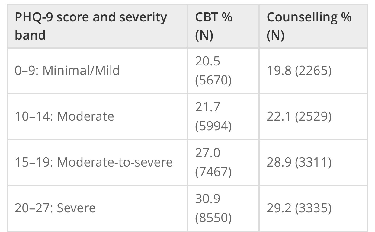
- The study published a table showing both therapist types saw cases of similar severity which suggests that the sampling frame they used did provide an iid sample. It’s a “yes”.

PHQ-9 is a depression measure
- That’s a clear “no”. As the groups weren’t randomised, we can’t be sure they were the same on unmeasured variables. As discharge is driven be either patient recovery or desire to continue, then, given the charts, it seems likely the two groups weren’t.
- The sizes reported in the table are very large for mental health studies, so that’s a “yes”
- Another “no”
- The study references the PHQ-9’s reliability and validity studies, so that’s a “yes”
- Despite my example with the charts above, there is such an analysis in the study. It reported 46.6% of patients receiving CBT improved, versus 44.3% of patients receiving counselling, if the patients met diagnostic criteria at outset. The comparable figures, including also people who did not meet diagnostic criteria, were 50.4% vs 49.6%. We can now see how misleading those charts were!
- The study report isn’t clear on this, so it’s a “don’t know”
We can see that our questions don’t return a clear “yes or no” answer to how much trust we should place on the study. My own take home messages are that counselling and CBT might be best for different patients, but neither is going to get more than half of those they see better.
The trial has reported its results were significant. What does that mean?
Years ago, that statement was synonymous with “Yay! It works!”. We now know better. Let’s think about a very simple RCT, with only two groups, one treatment, and one outcome measure, with an interval scale. In this context, the term is short for “statistically significant”: after the treatment, when we measured the means of the two groups, they were sufficiently different to say that, even allowing for error, there was a less than 5% chance of them being means of the same group, so the groups were no longer iid. This 5% limit has been arrived at by custom, but if we look back at where it cuts the normal distribution it’s outside most of the mass of the distribution, so it kind of makes sense.
However, if we look back to how the standard errors of our two means are calculated, then we can see that they will shrink the more cases we have. At very large numbers, we will be able to detect tiny differences: statistically significant, but practically pointless. What we need is a measure of what is called effect size. For our example, the difference between the two means, measured in standardised deviations, the “standardised mean difference” (SMD) works well. The table below gives some ways of interpreting it.
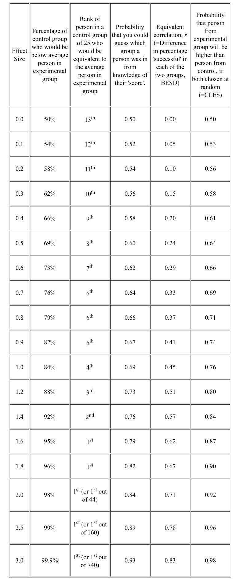
BESD Binomial Effect Size Display CLES Common Language Effect Size
Thinking back to our example study, the 50% recovery rate can be related to the 4th column (none were recovered before, around half were afterwards, so the BESD was around 0.5), and equates to an SMD effect size of 1.2. However, the lack of blinding, and the use of “admission” and “discharge” endpoints are all likely to have inflated this figure, while lack of randomisation will have had an unpredictable effect.
We have derived our concept of effect size as standardised mean difference from the normal distribution. However, even when our outcomes are a simple yes/no, we can calculate a SMD from it. This has been very useful when combining studies together, which is our next topic.
Systematic Reviews and Meta-Analysis
Let’s start by clearing up two common mistakes
- A systematic review is not a meta-analysis
- A meta-analysis is not necessarily better than a well designed single clinical study.
In times of yore, all reviews were what are now called “narrative reviews”, which are basically stories justified by references. While obviously valuable when it comes to making sense of things, bias, and the pressure to make some sense, leads to reviews which may support either “yes” or “no”, when the right answer is “I haven’t a clue.”

Doing a narrative review is all about choosing…
- The reviewer decides the studies can’t be meaningfully combined, so writes a narrative review of the different stories they tell, and explains why any combination won’t work.
- The reviewer decides the studies (or at least some of them) can be combined as if they were one big study. The processs of doing this, and interpreting what comes out, is callled meta-analysis.
Whether the studies can be combined will depend on the extent they can be considered iid with respect both to each other and the population, and that’s a big ask.

Same thing, different researchers, different methods, different results
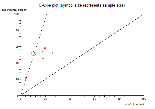
The horizontal axis reports the percentage recovered in the control group, while the vertical axis does the same for those receiving treatment: this is a way of looking at BESD correlations. The diagonal line splits the chart into two halves. For anything in the upper triangle, treatment is more effective than control, while the reverse holds for the lower triangle. The studies form a reasonably tight group, suggesting similar BESDs, supporting the view they might be regarded as iid. The dashed line is the best straight line we can draw through all the studies. We can see that the two big studies (the largest circles) have dragged the line firmly to the left. If they were both from the same group of researchers, a reviewer might want to look at them more closely.
Another source of bias is called the “file drawer” problem: studies that give negative results are less likely to be published. One way of detecting this is by a funnel plot, as shown below.

The horizontal axis measures the effect size (SMD), as discussed above. The vertical axis measures the standard error of each study. The analysis’ studies are all plotted as points on the plot. The two straight lines forming an isosceles triangle (the funnel) are either edge of the boundary of the 95% standard error of the effect size for a given standard error. The apex of the triangle is set at the average effect size the study calculated. The central vertical makes it easier to read.
This is from a real meta-analysis of talking therapies for adult depression. From what we’ve covered above about effect sizes and standard errors, we’d expect the dots splattered pretty evenly around the divided triangle, but that’s clearly not happened here. In this analysis, a positive effect size favours treatment over control. There’s a general trend for there to be more studies than expected with results greater than the average effect size, and there is a serious dearth of small studies (larger standard errors) with less than the average effect size. People aren’t publishing small studies with small effects, but are if they have large effects, and even large studies won’t get published if the effect is sufficiently small (or negative!). The average effect size calculated by the researchers has actually been corrected for this bias prior to the plot being drawn, which is why we can see the effect so clearly.
Meta-analyses usually use fairly standard methods of displaying their results, but we need another concept to make sense of them. It’s actually been here throughout the blog, lurking in the background.
Measuring uncertainty
In reality, we usually don’t take multiple samples to measure our iid population, we take one. After all, we’ve decided it’s iid. So, we measure our mean, and know it’s got a standard error of σ/√N. As we’re measuring an iid population, we’re pretty confident this distribution is going to be normal, just like the population distribution we are measuring. In fact, there’s a helpful theorem, the central limit theorem, that states this will be so provided our sample is big enough, so we can prove it if we really have to. As we discussed above, we can interpret the horizontal axis of our distribution chart as measuring the probability of a particular value occurring, and therefore we can think about the distance between two values as the probability that the true value lies between them: that’s what we just did in the funnel plot. We call this distance our confidence interval, and it’s usually set to cover 95% of the distribution. Here’s how they work
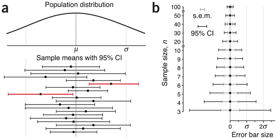
In both the charts, our sample means are shown by dots, with their 95% confidence intervals as the lines stretching out either side, called error bars. The first chart, a, shows our not amazingly successful attempts to sample the population distribution at the top. Two of our samples, indicated in red, have 95% confidence intervals that do not cross the population mean. This has actually happened by chance, and the width of our error bars tells us we have been trying to use small samples. As we have seen above, the smaller the sample, the harder it will be to keep it iid with its parent population, particularly one as scattered as this distribution. The relationship between our confidence intervals and sample size is shown in chart b, with the widths of our error bars decreasing as the sample sizes used to estimate them increase (yes, that’s what makes the funnel in a funnel plot).
We can now say what meat-analysis is trying to do, and it’s gratifyingly simple.
Meta-analyses try to estimate both the mean and the 95% confidence interval of the treatment effect from the combined iid studies.
Let’s have a look at a similar plot (they’re called forest plots) from a real meta-analysis, also about homeopathy.
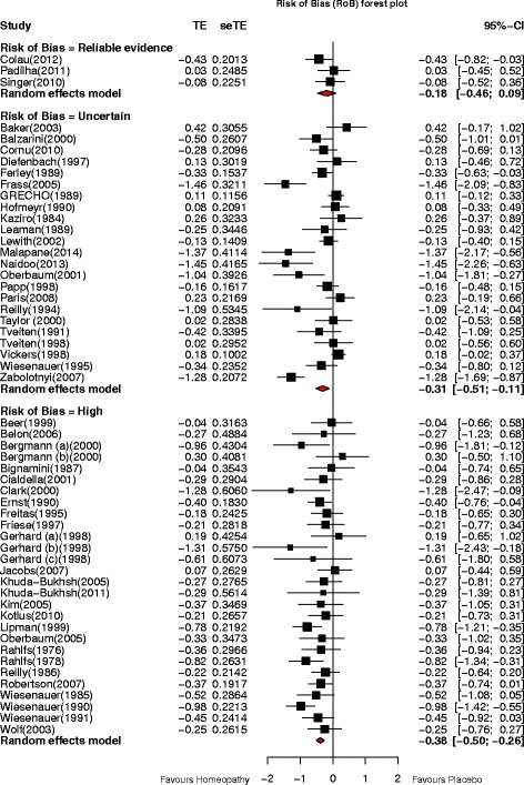
Everything is measured in standard errors. TE=Treatment Effect, seTE=Standard Error of Treatment Effect, CI=Confidence Interval
As shrinking error bars with sample size make smaller studies more visible, the mean treatment effects of each study have bean displayed as black squares whose area is proportional to the number in the study’s sample. The meta-analysis’ contribution is the set of three diamonds below each column of studies. The vertical points of the diamonds are aligned with the average treatment effect, while the horizontal points define its 95% confidence interval. We can see that this meta-analysis is making the same point as the previous one about homeopathy: as our control of possible bias gets better, so the effect size reduces: we can now see that, for the best studies, we cannot be confident that there is any effect of homeopathy at all, as the top diamond crosses the “no effect” line.
We can now put together a set of 7 questions to help us evaluate a meta-analysis.
- Is the literature search to obtain the studies likely to have got them all? (failure invites bias)
- Are there enough similar studies to do a convincing meta-analysis?
- Have the studies been adequately screened for quality?
- Have they described how they addressed heterogeneity?
- Have they addressed publication bias?
- How big is the average effect size?
- Does its standard error overlap the “no effect” line?
As we can see, there is no guarantee a meta-analysis will always provide better treatment data than a well designed RCT.
Let’s start by looking at what meta-analyses can do. If we compare the results of the meta-analysis of talking therapies (effect size around 0.5) with the large non-randomised comparison of CBT and counselling discussed earlier, we can see that less than half of the overall treatment effect (1.2, remember) is down to efficacy (our definition of variance, discussed above, lets us claim things like that). That doesn’t mean the therapists should give up and go home: the non-specific effects that are doing so much to get the patients better may well be embedded in the service, and would also disappear if the service was removed. However, it does tell us that, if around half of everybody is getting better with therapy, offering even more therapy is unlikely to change things much. It also tells us that therapy should remain an option: checking our table above shows a 0.5 effect size is still valuable.
Now let’s think about what they can’t do. Combining studies, as we’ve just seen, can add a whole new layer of error, and lots of additional assumptions. Large, biased studies can distort their results, as can hidden studies with negative findings. Meanwhile, lots of small studies introduce noise and unpredictable extreme results, as the smaller they are, the harder it is for their comparison groups to be iid with respect to each other. Because of how meta-analysis works, these errors propagate through the calculations. This means that a meta-analysis can never equal a single well-designed RCT of equivalent size. However, very large RCTs have their own problem, like cost, so the current system of using both as appropriate seems best. In the end, they are just different ways of answering the same simple question: does giving a treatment make a measurable difference?
